3 Easy Ways To Make a Gantt Chart (+ Free Excel Template)

If you manage projects, you will have come across a Gantt chart. Even if you don’t manage projects but are involved in project teams, or you manage
I have used Microsoft Project for many years and it creates great Gantt charts. But MS Project, and tools like it, are often overkill for project stakeholders who don’t care about all the detail. The Gantt chart format is often a poor way to communicate to stakeholders.
So what do you use instead? Or what can you use if your project doesn’t warrant a massive Gantt chart? Or if you want to use a Gantt chart but you don’t have any specialist software to create one?
I can help! In this article you’ll learn how to create Gantt charts using PowerPoint and Excel: tools you most likely already have. There’s another graphics package I use to create Gantt charts for presentations as well, Vizzlo.
Get a free basic Gantt Chart Excel template in my project management resource library. It’s a subscriber-only benefit and you’ll get access to over 20 free project management templates and resources to help you keep your projects and career on track.
In the article you’ll also find out what has to go in your Gantt chart to make it fit for purpose, and I’ll share some other tips for working with Gantt charts.
Let’s get started!
Method #1: Make a Gantt Chart with Office Timeline PowerPoint Plugin
Office Timeline is a clever free plugin for Microsoft PowerPoint. It’s Gantt chart creator software that lets you create neat Gantt charts from within PowerPoint itself.
You can choose dates, set milestones and show progress (showing progress is only an option with the paid version). It’s as easy to use as the rest of PowerPoint. If you create a lot of status reports in PowerPoint, this is a simple way of designing Gantt charts for communication purposes direct on your slides.
Watch this video for a short tutorial on how to create a Gantt chart with Office Timeline PowerPoint plugin.
More free PowerPoint templates
Project status update timeline
Executive timeline update
Project Ganttchart template
Annual project timeline
Method #2: Make a Gantt Chart with Excel
How do I create a Gantt chart in Excel?
I’ve been asked that a lot! OK, OK, I know that Excel is not a traditional Gantt chart tool. But I do have something to share with you that will magically make it into a Gantt chart tool.
Why use Excel? We need to be realistic about our teams’ and stakeholders’ capability to review and understand Gantt charts at all. That’s where Excel comes in. It’s easy to understand and easy to use, because most stakeholders are already familiar with the concept of spreadsheets.
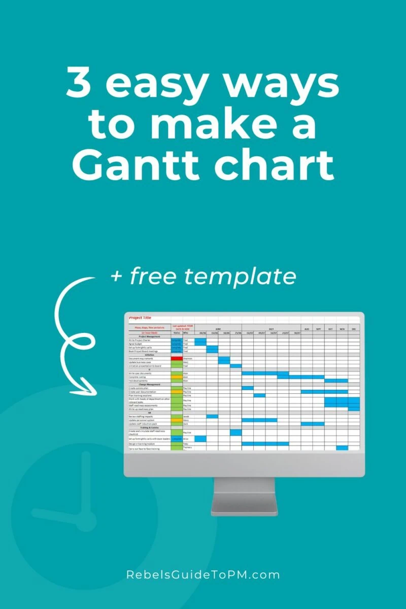
Here’s an example of how a Gantt chart Excel schedule can look. It’s clean, colorful and shows everything you would expect from a Gantt chart in a very user-friendly way.
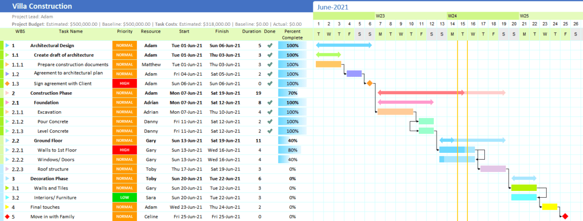
This spreadsheet version was created with Gantt Excel, a cost-effective plugin that turns Excel into something that functions as a Gantt chart, with virtually no learning curve!
DIY version
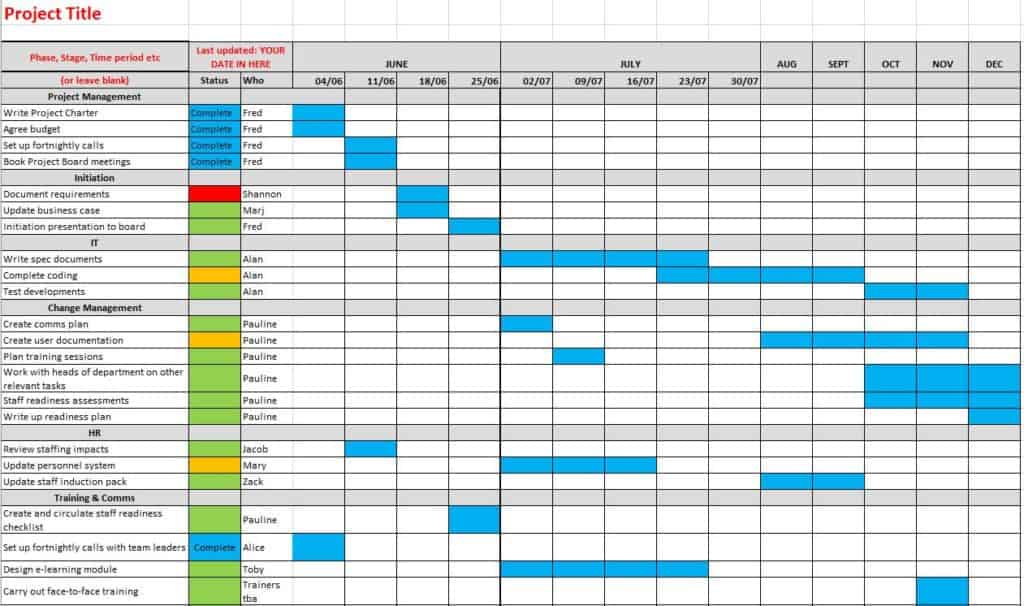
An even simpler option is to use Excel to mock up what looks like a Gantt chart.
It’s not strictly speaking a ‘real’ Gantt chart, but it is good enough as as a communication tool for most stakeholders, especially in teams where there is low project management maturity and they aren’t used to looking at the real thing.
Here’s a spreadsheet that looks a bit Gantt-y.
Method #3: Make a Gantt Chart with Vizzlo
Vizzlo is a web-based business graphics software tool. It’s point-and-click, all the design is baked in and you don’t have to do very much beyond add in your data.
It creates fantastic graphics for presentations like charts and graphs, and can also serve as Gantt chart creator software.
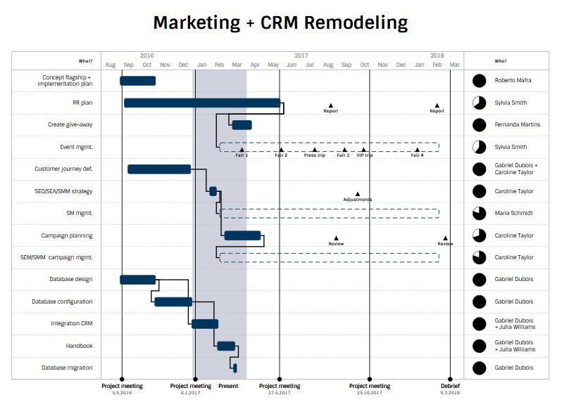
Here’s a very basic Gantt chart I created as an example in about 10 minutes.
You can change the styling by taking off the frame to make it look sleeker. You don’t have to include dependencies or names. You can add progress markers through displaying Harvey balls, as you can see in this example from the site.
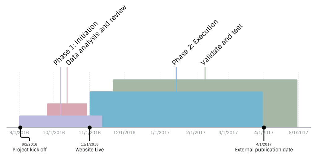
You can also create something even simpler to show project phases or a set of long tasks. This is a layered timeline:
Vizzlo is easy to use and cost-effective if you are doing lots of presentations. I probably use it a couple of times a month for presentations and blog graphics, and I feel it pays for itself in the time it saves me.
Read my full review of Vizzlo here.
Essential Information to Include on a Gantt Chart
Now we’ve looked at 3 easy ways to create Gantt charts from scratch and I’ve given you some examples, let’s talk about what needs to go on your Gantt chart.
Gantt charts have the option to include lots more information, but these are the essentials that should definitely be included.
1. Task name
This one is pretty obvious! You need to include the name of the task. This shows you what is being worked on. I don’t need to add any more.
2. Task lengths
The horizontal bars on a Gantt chart represent the length of a task. You can quickly see how long any task is in comparison to other work.
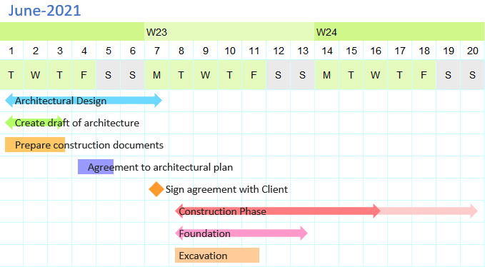
For example, if your project testing phase is only shown by a short bar you can consider whether you should add in longer for testing! (Yes, you should!)
The bars can also help you spot tasks that should really be broken down. You should split a long bar that runs across several months for a task like ‘market research’. Break it into smaller tasks with shorter durations as that is easier to track and manage.
Tip
Highlight start dates and end dates to make it extra clear when activities are running.
3. Task relationships
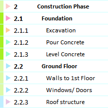
Gantt charts have a hierarchy. Parent tasks have child (subordinate) tasks underneath. The parent task is the major task with all the sub-tasks listed below it.
Tip
You can indent in Excel so you can show parent and child tasks. It’s messier to do this with the Office Timeline PowerPoint plugin so I would stick to only showing parent tasks in your presentation.
The hierarchical layout lets you see what activities go together. You can also hide lines in Excel or roll up tasks in MS Project to minimize distractions on the screen when you are looking at particular activities.
4. Task dependencies
Dependencies are shown on Gantt charts as black arrows that link tasks together. If you have a large Gantt chart, the arrows can go all over the place and it can look quite messy.
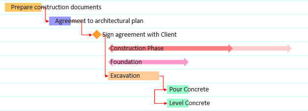
I’d advise that you think carefully about whether it is worth putting dependencies on Gantt charts that are predominantly for presentations or communication purposes. In my experience most people assume that a task that comes after another task is dependent on the first task. They don’t need the lines to tell them that.
Tip
Adding dependencies in Vizzlo works on a ‘dependent on’ basis, so highlight the successor task and add the name of the predecessor.
Read next: 5 Steps for Identifying Project Dependencies and Constraints
5. Milestones
Milestones are typically represented on a Gantt chart as black diamonds. You should have milestones scattered liberally throughout your project. I find it helpful to have one per month as that’s useful for tracking and reporting.
However, be guided by the type and size of your project and use your professional judgement. If you don’t need that many, don’t make them up for the sake of it.
From a visual perspective, milestones make it easy to see upcoming major moments on projects. They are a quick way of identifying the next big step, sign off point or achievement.

Tips for Working With Gantt Charts
So you’ve got your tool, a template if possible as a starting point, and you have the data to include. What could go wrong now?!
I’ve spent many hours working with project managers and helping them build better Gantt charts. You need a good schedule for your project, as it’s the document you will use most of all. Poor planning really can kill you project.
Here are my tips for working with Gantt charts.
Tip #1: Start With The Task List
Don’t start with a blank screen. Create your task list first. Do it with the team. Use a work breakdown structure.
It doesn’t actually matter how you come up with your task list as long as it is comprehensive and everyone agrees on it.
Tip #2: Add the Dependencies
By itself, the task list is virtually useless. You have to work out what activity can be done when. The order of tasks is almost as important as the tasks themselves.
The right order adds efficiency and stops your team members sitting around waiting for handovers before they can start their tasks.
Before you start scheduling on a Gantt chart, it helps to know what tasks are dependent on what. You can add the dependencies afterwards, but your schedule will look cleaner if you can group dependent tasks together as you type them in – it saves you having to move them around later.
Tip #3: Include Enough Milestones
I’ve touched on that above – you should have at least one milestone per month as a rule of thumb, and as many as you need to help you monitor and control the project.
Milestones represent fixed moments in time, like the end of a phase or the date of a quality review. You can link them to tasks if that makes sense. For example, the task ‘test software’ might lead into a milestone called ‘testing complete’.
Tip #4: Use Colors
Gantt charts can be tricky to understand, so use everything available to you to improve comprehension. Colors are one way to do that.
You could choose different colors for different workstreams or task owners. Highlight the critical path in red. Show work that is only tentatively scheduled in another color. You could also use colors to show whether a task is overdue (red) or on track (green).
Make sure that you explain your color code somewhere so people know what it all means!
Tip #5: Add Your Resources
You don’t have to add resources to a Gantt chart, but I think it helps. It helps your team members take responsibility for their work. It reminds you who is doing what so you don’t have to check another document. And if you use resource management or capacity planning techniques, it can automatically update those systems.
Consider learning even the basics about critical chain scheduling to help you better manage resources.
Bonus Tip: Don’t Print the Gantt Chart!
Gantt charts that run to any length are very difficult to format nicely to print. I have spent unhappy times trying to tape a Gantt chart from MS Project together before realizing it was out of date as soon as the final page was attached. Just don’t.
If you can, avoid printing them out. Use them on the screen in meetings or share them electronically with your colleagues. If you have to print them, shorten the timeline as much as possible and hide all the tasks that aren’t absolutely essential.
My conclusions: The best tools for producing Gantt charts
Office Timeline and Vizzlo are perfect tools for creating shorter Gantt charts for printing, sharing and communication purposes, while the Gantt Excel tool or enterprise project management tools (if you have them) are better for actively managing the work.
Gantt charts are an essential part of a project manager’s toolbox. You may not use them on all projects, and the techniques in this article probably won’t be sufficient to manage large projects.
However, the Gantt format gets easier to use the more you do it, so why not try creating a Gantt chart on your next project, however small?
FAQ
What information goes on a Gantt chart?
As a minimum, task name, task duration and start date, task hierarchy, dependencies and milestones go on a Gantt chart. You can also add resource names, effort, finish dates, percent complete or configure data columns to show exactly what you need.
What is a Gantt chart used for?
A Gantt chart is used for project scheduling and then to monitor actual progress against planned progress so you can keep your project on track.
How do I make a Gantt chart in Excel?
Write your list of tasks down the page. Add a column for the person responsible. Then add dates in the columns across — one week per column tends to work at a high level. Use colors to show which tasks are happening on which dates.
Next steps
Now you understand the practicalities of putting together a Gantt chart, it’s time to brush up your scheduling skills so you don’t make these common scheduling errors.
Featured Software Partners
Create impressive timelines in just a few clicks with this plugin for PowerPoint. Try Office Timeline Pro+ free for 14 days. Create beautiful timelines and Gantt charts right in PowerPoint. Perfect for your next stakeholder presentation!
A great tool for organizing all our work, schedules and task allocations in the team. We wouldn't be without it!
Get fast & free advice from the experts at Crozdesk.com. Crozdesk's small team of dedicated Project Management software enthusiasts will compare 360+ products for you. Tell them your requirements and they'll match you with the right expert who can help.
- No Obligations
- Free Service
- Exclusive Discounts
- Expert Advice
- Minimal Time Commitment
- Get a Custom Comparison Report
