Software Review: Vizzlo
This blog is reader-supported. When you purchase something through an affiliate link on this site, I may earn some coffee money. Thanks! Learn more.
Read our review guidelines.
I’ve been using Vizzlo since probably around 2016, when my first Vizzlo review appeared. I’ve updated this revieew to reflect changes in the tool since then. I am still an active user and you can see graphics created with Vizzlo all over this site.
General Information
Name: Vizzlo
Vendor: Vizzlo
Hosting options: Web only
Cost and plans: Free plan (includes Vizzlo branding on your images), Professional Plan at $11 per month, plus options for businesses that include sharing images between team members from $45 per month for 5 seats.
Languages: English

How I did this review
I am a paid subscriber to Vizzlo. I use the tool regularly to create images for work and also for this blog. I’ve reviewed based on my personal experience with using the tool over many years.
How software reviews happen
This is how the software review process normally goes for me.
Software company: We’ve got a really cool product we’d like you to review.
Me: Oh?
Software company: It does 1000 things and will take you hours to investigate and review thoroughly, but it’s really good.
Me: Will I actually use it in my daily life afterwards?
Me (answering Me): No. I’m happy with the tools I have thanks.
Software company: So will you review it?
Me: Meh. Maybe.
It started the same with Vizzlo: “Dear Elizabeth, we love your blog, please review our software.”
But then I looked at it. And bought it.
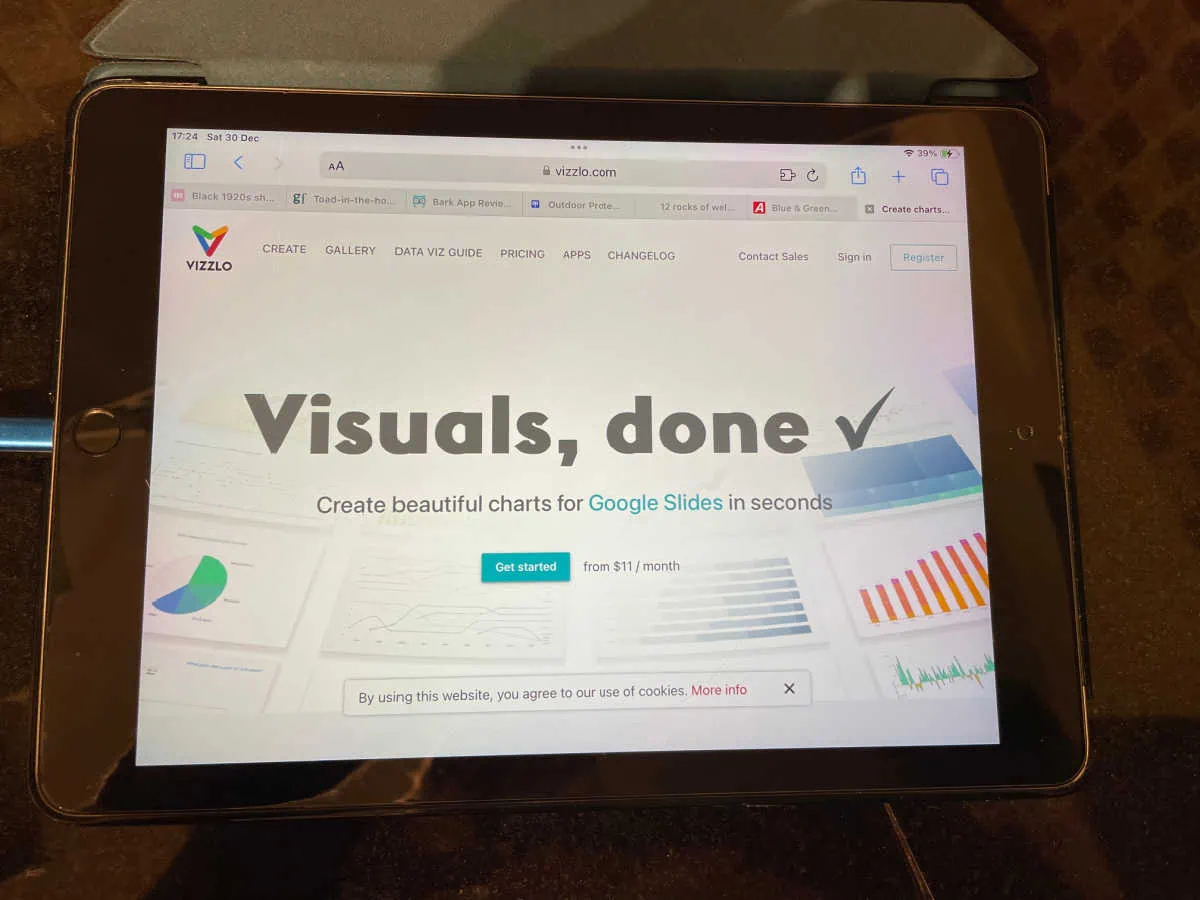
Goodbye mediocre business graphics
I’ve used Vizzlo to create graphics for both my roles: as a salaried project manager, and as a content creator here at RebelsGuideToPM.com.
I’ve even used it to help my children with their homework. Need to mark the Roman empire on a map? No problem! Vizzlo has a map graphic where you can toggle on/off any country and zoom into the part of the world you want to print.
Vizzlo has over 75 template graphics for you to choose from, covering everything from Venn diagrams to milestone charts, timelines, maps and process diagrams.
It also has Gantt charts and waterfall diagrams. I don’t use these as a replacement for my trusted project management tools for scheduling, but it is useful to do a summary, pretty-looking Gantt chart summary for stakeholders who won’t understand a 1000-line MS Project plan.
Here’s a picture that took even less time that that (shush, don’t tell anyone. I’d rather you all thought I spent hours creating bespoke graphics).
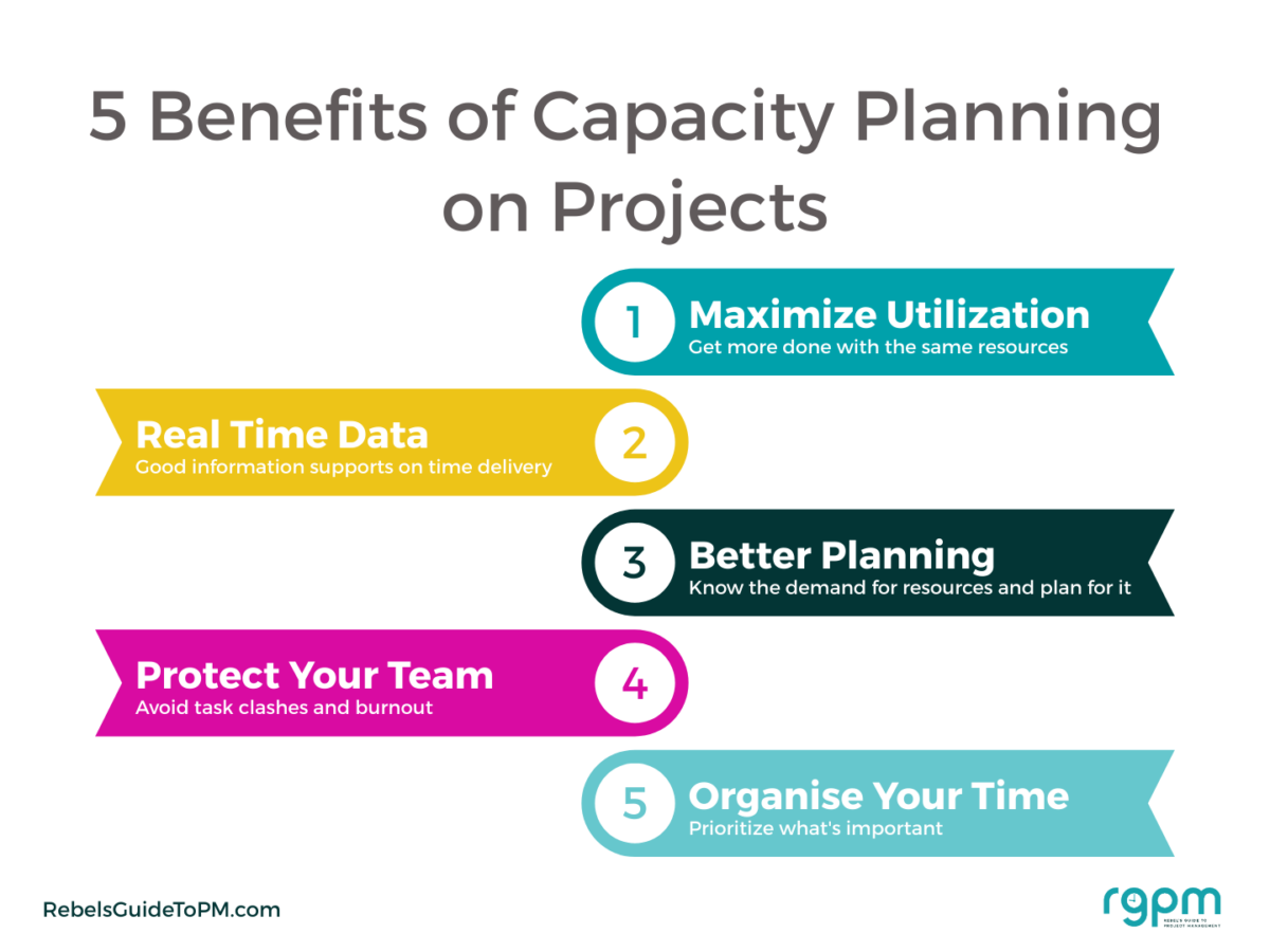
Check out the branding in the footer and the brand color scheme and fonts – that’s all default set in my profile. I switch between profiles so I can create those in my company branding (for salaried work) and blog branding. And also for my niche forest school blog, like this one.
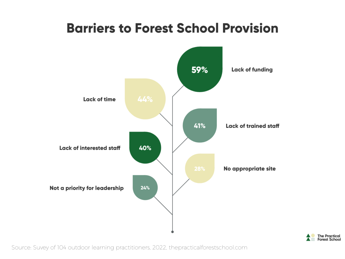
Very pretty and super quick to put together.
Creating your first vizzard
Why they had to call them Vizzards and not ‘graphics’ or something that actually made sense, I don’t know. But the library is full of Vizzards (i.e. templates) and that’s where you start.
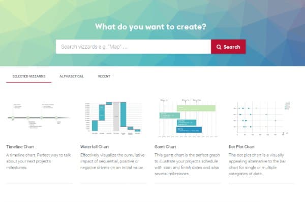
Choose what you want to create. It’s not an unlimited choice – you can’t start from a blank sheet and add icons to make your own – but there’s enough stuff in there to create pretty slides for presentations and project communications. The company also adds more designs on a regular basis.
I particularly like the holiday themed ones, and I do have a couple of favorites. There are some good graphics specifically for start ups and also project teams, so you will find something that meets your needs.
Let’s create a simple rhombus milestone plan, with colorful blocks. Once I’ve chosen it from the Market and hit Create, up pops my edit screen.
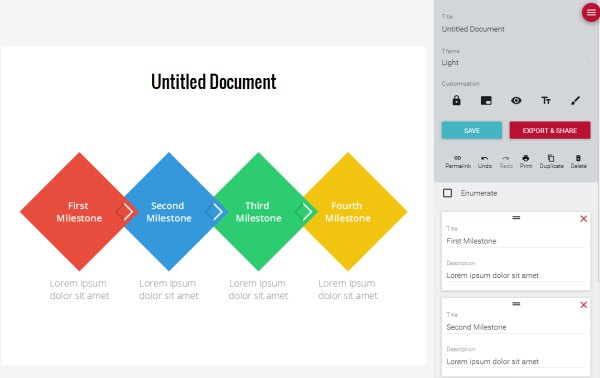
This is what you can see if you have a paid-for account, so if you go for a free account you won’t get all the options to customize the colors.
It’s really easy to add more units to whatever template you are using. What I have found though is that the size of the page is fixed. As you add more boxes, rhombi or whatever, the amount of words you can fit in each of them gets smaller. So you do have to choose your template carefully.
Change the titles and descriptions, edit the theme if you like, decide if you want the points numbered or not and you’re done.
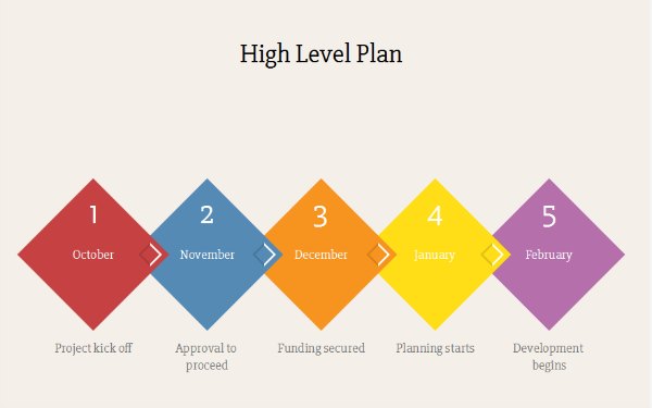
Hit save and the graphic is stored in your Documents tab so you can go back and edit it if you need to. This is a really useful feature to have as you can make amends when your colleagues ask you to tweak the image.
You can save images into folders so I have various folders set up to keep images created for different brands separate from each other.
Benefits of Vizzlo
The advantages of Vizzlo are:
- It’s fast.
- It’s structured.
- The user interface is clean and easy – no learning curve.
- You can store you documents to edit later – essential if you do have milestone charts in there that need to be edited for your next presentation.
- You can pop your creations into folders so you can organize your graphics.
- It’s not expensive, given the amount of time it saves me.
Being so fast to use makes it advantageous in comparison to PowerPoint. Plus, the images you get look better than the SmartArt alternatives that you could create in PowerPoint.
Limitations of Vizzlo
The disadvantages of Vizzlo are:
- Limited default options for page sizing leading to too much white space padding between graphic and heading with some sizes.
- Limited default theme templates (don’t use them! Create your own bespoke theme).
- Default theme styling looks dated.
- Some templates are hard to use as you can’t see how to edit the content. For example, I had to email support to get instructions on how to edit the leaf chart as it wasn’t clear to me how to change the text.
- Slow support. The email support is not the fastest — this might be a concern if you are preparing a report or presentation deck with a time limit.
When I first came across Vizzlo, the thing that I found the most disappointing is the selection of default theme templates. The Vizzards in the marketplace look beautiful with nice greens and blues. This isn’t a default style.
The only one I felt comfortable using was the Light theme and that’s mainly the reason I upgraded to a paid account, so I had more control over the colors, and also could take off the Vizzlo branding which is important (in my opinion) for professional documents presented internally.
However, since I started using it in 2016, the company has added new themes, and given you the option to create your own. I have created my own theme in company colors and fonts, plus uploaded my own watermark, so now I can quickly apply a color palette to the graphics I create. You can still tweak within the graphic if you want to amend the colors in a particular image.
The biggest limitation for me was that sometimes I want to change the font size, and that’s tricky (or sometimes impossible) to do within the theme, because of how much text you are able to put in some of the fields. However, the tool keeps getting better and better and you can change the font size within boxes now! This is a game-changer for usability.
Latest improvements
What I have found is that in the last couple of years I don’t feel many new graphics and templates have been added. Instead, they are working at making the ones that are currently available even better. You can edit data within spreadsheets, move things around on the page, resize the page and more.
Recently, they’ve added more nuance within the graphics, like scale breaks, custom formatting for labels, and exporting with pixel density options.
There are still some limitations — it’s not a full graphic design tool so I don’t design ‘finished’ images in it. But you can export images with a transparent background as a .png file and insert them into your other designs on slides. Given that Vizzlo is really for charts and graphs that would end up in slides or reports, you can live with the design limitations.
For example, I would still like to be able to manage the amount of white space on the page and resize the graphic so it truly filled the slide. With some size options, the graphic looks small in the middle and too far away from the heading. But that’s a small thing.
The tool now has an app version that allows you to work offline! There are also tons of small bug fixes released every month and they are totally transparent about what is being fixed/improved. Check out the change log on the website to see the tweaks and updates.
In summary…
I love Vizzlo and I’ve renewed my annual subscription again this year. I do get a lot of use out of it. I’m averaging a couple of graphics a week at the moment – not hundreds but enough to feel like it is helping add to my communications without adding a huge burden of trying to align elements in PowerPoint or start from scratch in Picmonkey.
It’s certainly something to check out if you create visual images for your project communications.
Pin for later reading
