Software Review: Paymo
Read our review guidelines.
General information
Name: Paymo
Vendor: Paymo LLC
Hosting options: Web; desktop: Windows, macOS, Linux; mobile: iOS, Android.
Cost and plans: The Small Office is the most popular plan, for $9.95/user/month. There’s also a Free plan and a Starter plan for $4.95 for a single user. The Business plan ($20.79/user/month) includes added features, like Gantt Portfolio and Resource Scheduling.
Languages: 23 options, one of the most generous I’ve ever seen!
Currency: 85+ currency options.
Basic features: Starting a project
None of the software I’ve reviewed this year makes it difficult to start a new project, and Paymo is no exception.
Use the big ‘Add Project’ button. Type in the project description, add the client info (I think this is mandatory), and set a color. There is a nice range of greens so I can choose one to match my corporate colors.
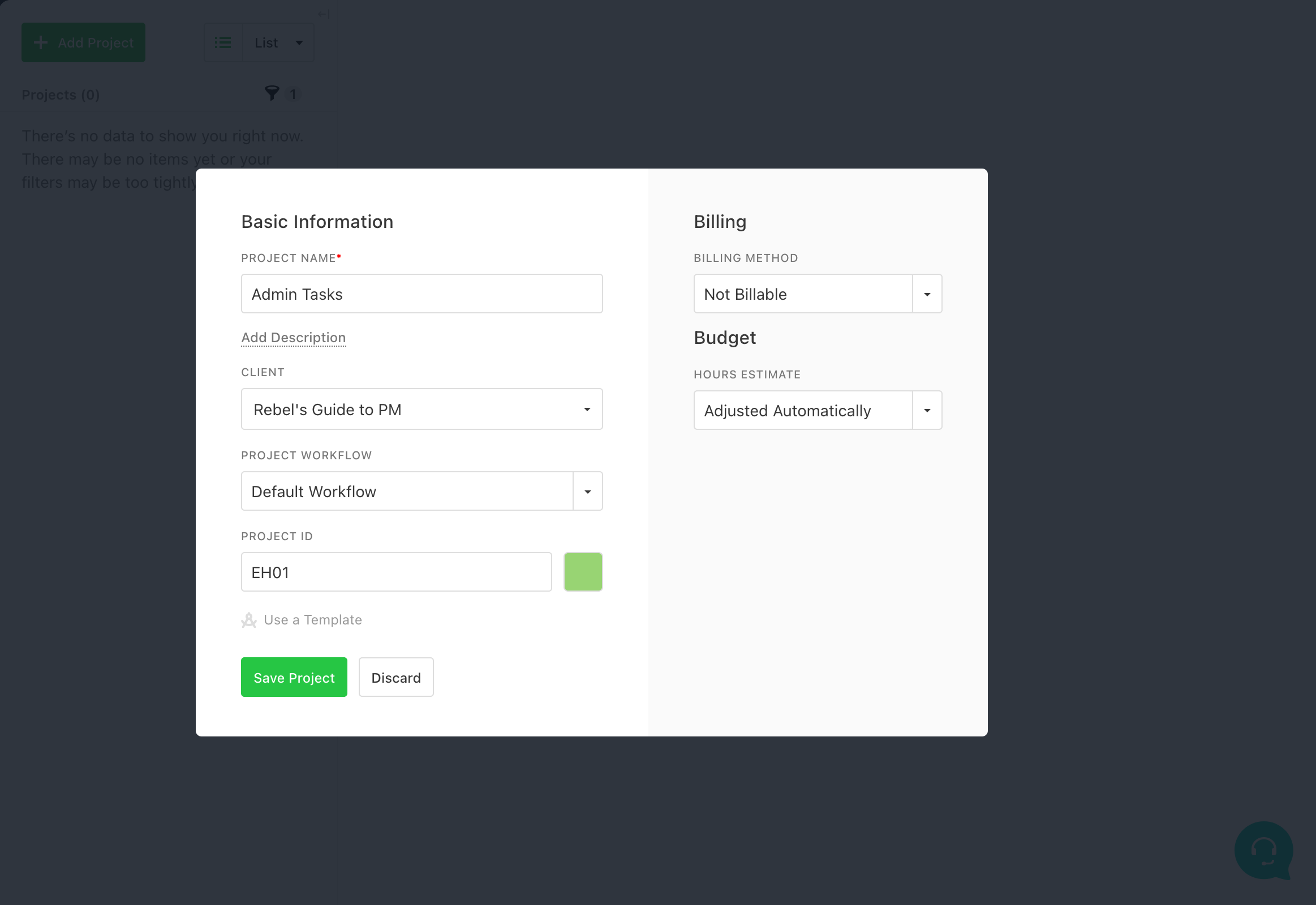
Creating a project in Paymo
You can then add tasks. I wasn’t massively impressed that each task has to be added to a task list. However, that is helpful if you are used to working with Kanban boards or in Microsoft Teams Tasks app, and are now making the move to a more robust project management solution.
You could also use a task list to group or categorize tasks by project stage or type of job. It’s easy enough to create a task list for ‘Miscellaneous’ work or ‘Other’ if you don’t want to use categories at all. Here’s an image showing a task list for the things that dropped out of a client meeting.
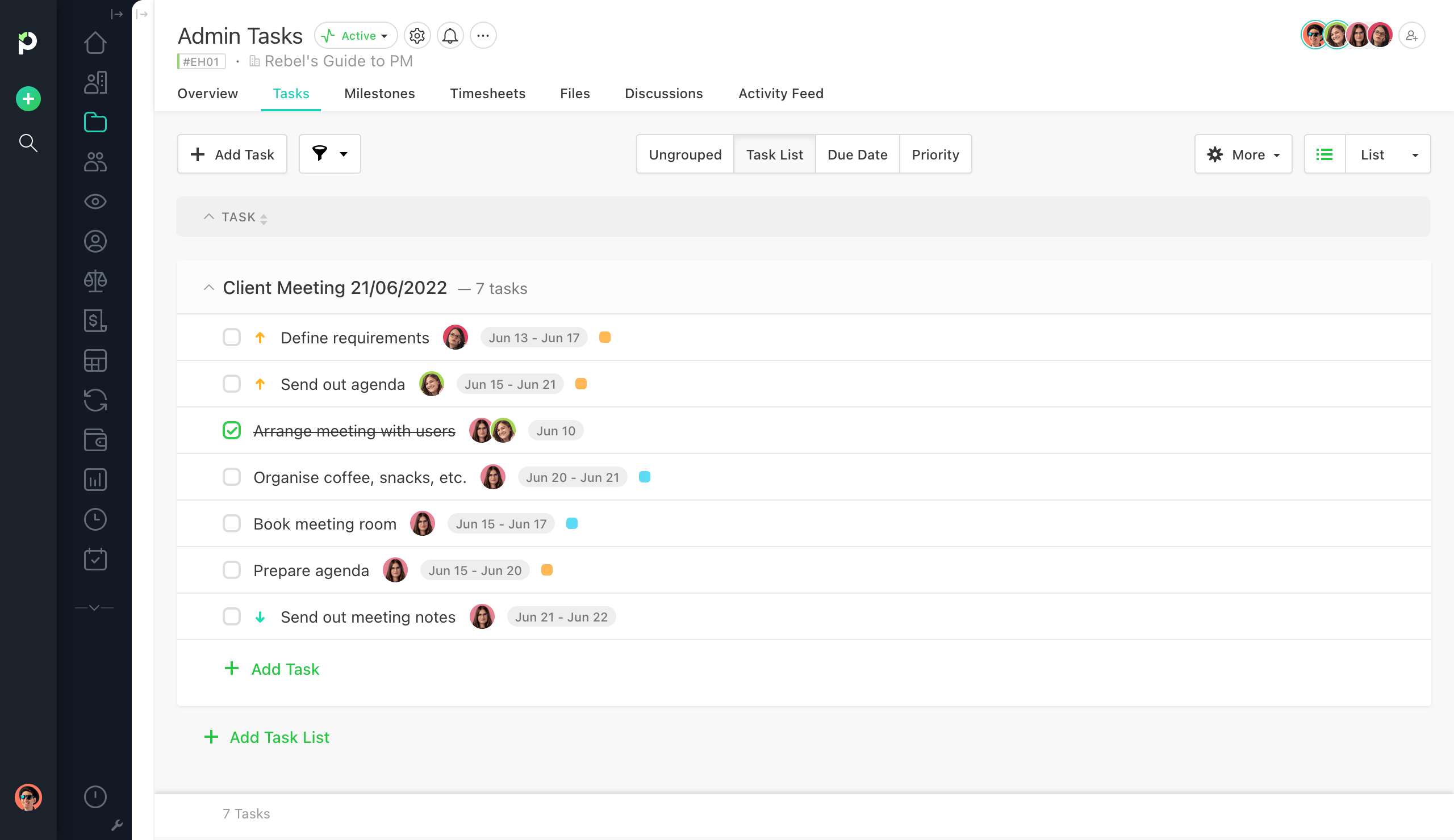
There are five different views: List, Table, Board, Calendar, and Gantt. You can switch between views, add filters, and even customize each view. Here’s a clean Kanban view of that same task list:
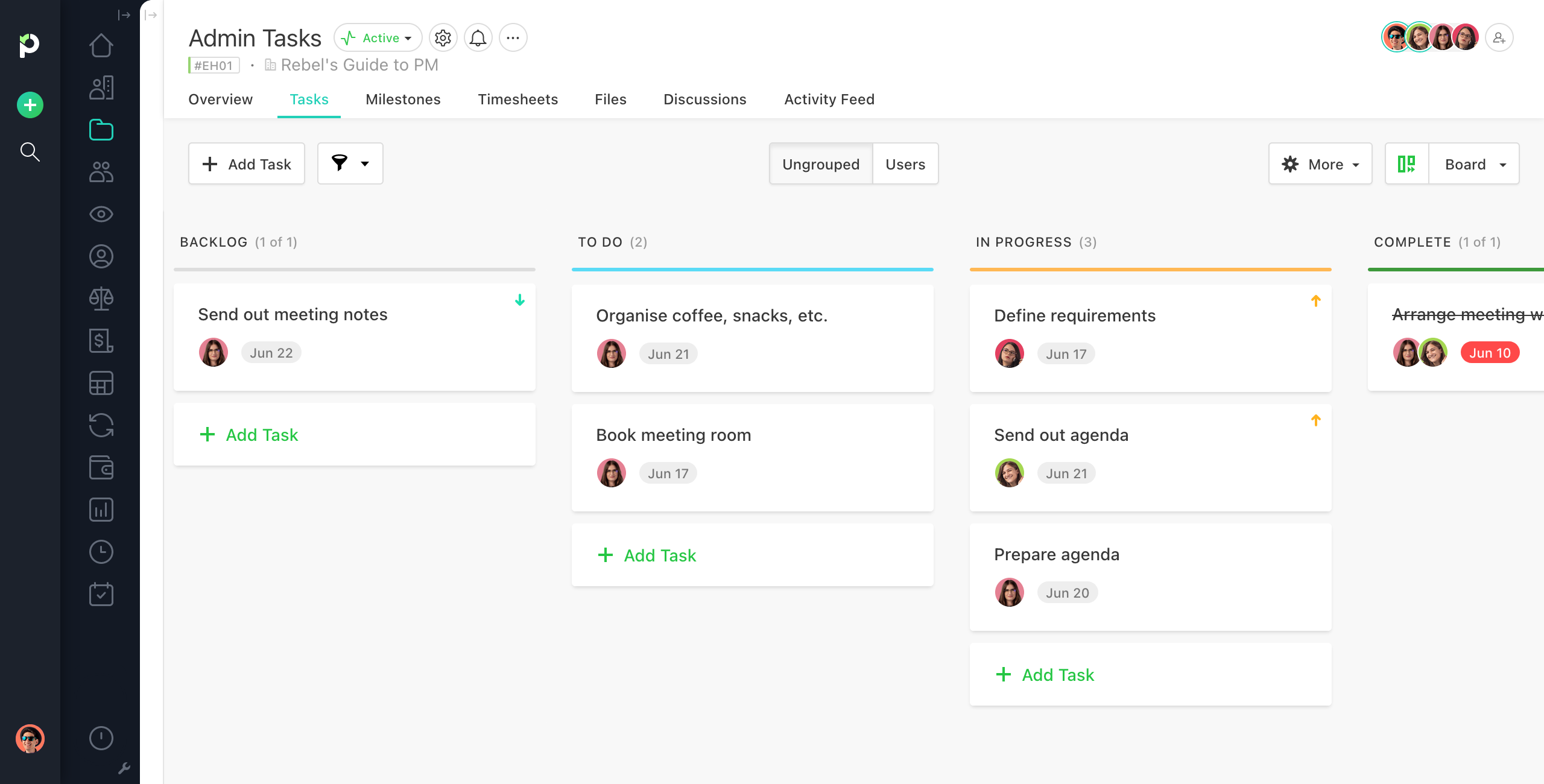
I like that you don’t have to click too much to move to the next task. If you have lots of tasks to enter, you can do them quickly. I am a big fan of not having too many mandatory fields. You can mark a task as complete from within the task details or the task list.
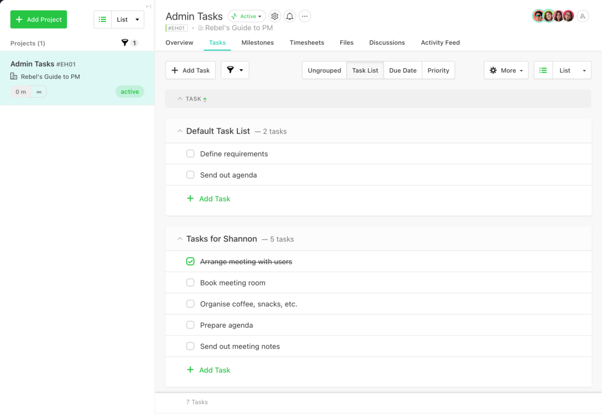
You don’t have to click save or enter on lots of the fields in the system, which is very slick. Once it’s on the screen, it’s done.
Client focused
Paymo is really aimed at small and medium-sized businesses which provide services to others. Everything to do with a project relates back to the client.
The reporting feature gives you lots of options, but essentially, they only report on time spent on the project (and the associated cost of this). These sorts of reports are handy for giving your clients or working out what to bill clients, but perhaps less useful for working out whether your internal team is over-resourced.
For that, head to the People module to analyze user performance or to the Team Scheduling module for a calendar breakdown of each user. You’ll need to be on the Business plan to have those options, but if you are using Paymo for resource allocation then you really should be.
The good thing about the reports is that you can have them either static or live, so you can produce real-time reports or snapshots depending on what you need.
The dashboard is where you’d go for your other data, and it looks very smart. You can’t drill down into the dashboard, which is a shame.
The dashboard picture in the help and on the Paymo website looks much better than the dashboard I had available, and not just because it had a ton more data in it. There obviously are additional widgets available but I wasn’t sure how to add them to the dashboard.
This is what yours might look like if you had various clients, projects, and more data:
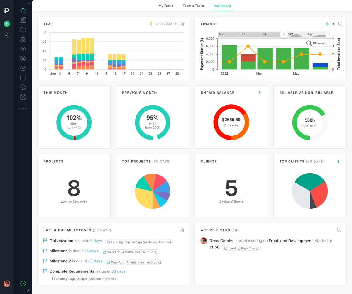
There is a full timesheet feature, with plenty of colorful ways to display the data. You can pick to view the data as lists, or month to view/week to view with different colors to highlight your different projects—hence the reason for choosing a project color. And you can use outstanding tasks and timesheets to generate invoices almost automatically.
Integrations and mobile
Paymo has an API, plus mobile apps for both Apple and Android devices.
Then there are desktop widgets for Windows, Linux, and Mac that let you easily track time on tasks and update your projects without having to have to go to the website all the time. There’s also lots of integrations, so it’s really flexible.
Tailoring it for you
One of the best things about Paymo is how much you can tailor it to suit you. Add photos of your team. Add a logo. Pick your colors. And best of all, you can change the date format, so you don’t have to have the month first! UK readers rejoice.
It might seem picky, but these little things make the difference between a totally smooth experience and a happy user and one who uses it because they have to and thinks it’s just OK.
To conclude…
If you run a consultancy, if you offer services to other businesses, if you are a freelancer, then this would work for you. It’s slick, well-designed, and targeted to a particular market.
The power of Paymo is in the integrated invoicing, financial reporting, billing, and client management. If you didn’t need that then you’d be wasting much of the functionality, in my view, as that’s what it does best.
June 2022 Update: Since writing my initial review they’ve added PM Payments, an integrated payment gateway system that allows clients to make payments to you directly from the invoice you send them.
Right to Reply
I shared this review with Laurentiu at Paymo and he commented:
The widgets are added automatically on your dashboard depending on the level of access, e.g. Admin, Project Manager, Project Member, Guest user. And of course, a Starter Plan will have a limited selection of widgets than the Small Office or Business plan.
If you’re keen on widgets and stats, we’re just about to roll out those reporting widgets you mentioned on figuring out your internal costs vs. what you’re billing your client. Stay tuned!
Full disclosure: I previously reviewed Paymo in 2015 and again in 2017. Paymo was been one of my blog sponsors in the past but I have not been paid for this review. Just thought you’d like to know!
