10 Reasons Why Project Managers Need Risk Burndown Charts
If you’re a project manager who wants to deliver successful projects while keeping risks under control, you, my friend, are in the right place.
Like many other project managers, I struggled with effectively communicating risk statuses to my stakeholders. My risk registers would become unwieldy documents that nobody read, mostly because they didn’t want to sift through the prioritized lists of risks for an idea on where we were when it came to closing out risks (their main concern).
And I knew I needed a simpler way to show that we were making progress. Which is where I started adapting risk burndown charts into my risk reporting.
What’s a risk burndown chart?
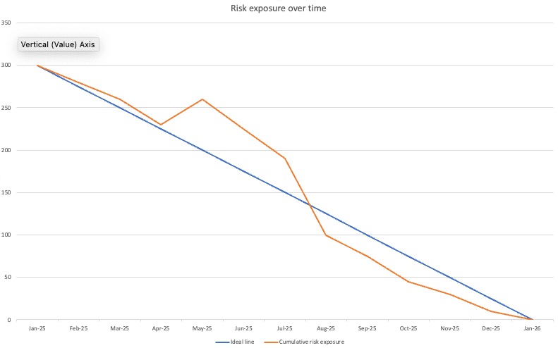
A risk burndown chart is a powerful visual tool that tracks your project’s risk exposure over time.
Originally introduced by John Brothers in The
Unlike traditional risk registers that list individual risks with their details, a burndown chart aggregates all risks into a single trend line, making it immediately clear whether your overall risk profile is decreasing, plateauing, or – worst case – increasing.
Burndown charts are typically associated with agile teams and sprint goals, but you can use the same techniques for risk.
This simple visual representation transforms complex risk data into an actionable insight that both team members and stakeholders can easily understand, allowing everyone to see at a glance if you’re successfully mitigating risks (severity over time decreases) or if urgent attention is needed.

Although internal team members might like the details around your risks, those external stakeholders want a simplified visual on the risk picture.
And the risk burndown chart provides just that even if, like me, you are not working in an
Not convinced? Here are 10 reasons why you and your project team need risk burndown charts starting today!
Reason #1: You’ll gain visual clarity on risk exposure
As I showed above, it’s easy to get lost in the details of a complex risk register. But it doesn’t have to overwhelm you, not with risk burndown charts.
When you know how to visualize your project’s overall risk exposure over time, you’ll quickly understand whether your risk management efforts are working or not.
Risk burndown charts transform complex risk data into a simple downward-sloping line that anyone can understand at a glance. Instead of wading through spreadsheets and text-heavy reports, you and your stakeholders can immediately see if risk levels are decreasing as expected.
Reason #2: You’ll make better-informed decisions
If you want to guide your project to success, you need to know where the dangers lie! Once you have clear visibility of risk trends, you can make informed decisions about where to focus resources and when to adjust your plans.
The chart plots cumulative project risk severity, so you can make choices about what to do next with that in mind.
Reason #3: You’ll establish credibility with stakeholders
The best way to establish credibility is to demonstrate control of project risks. You’ll be showing cumulative risk exposure and what you are doing about it.
Learning this technique will help position you as a professional who takes risk management and project planning seriously.
If you’re unsure where to start, begin by identifying your top ten project risks and plotting them on a simple chart. There are more tips for getting started at the end of this article.
Reason #4: You’ll improve team accountability
With multiple team members responsible for different risk mitigation actions, it can be challenging to track progress effectively.
Risk burndown charts give you a roadmap for monitoring risk ownership and creating an impactful risk mitigation plan.
When you implement regular updates to your risk burndown chart, you’ll improve accountability, increase transparency, and encourage proactive risk management across the entire team. And that translates to fewer surprises and smoother project execution.
Then, regardless of what unexpected events occur, you can respond effectively and maintain control throughout the project lifecycle.
Reason #5: You’ll gain confidence in your risk management approach
Do you suffer from uncertainty about whether your risk assessment efforts are adequate? Do you worry about risk audits? You’re not alone – every project manager does at times, so don’t feel bad about it. Instead, take action!
The fastest way to overcome this is to let data guide your risk management approach.
When you gain a deeper understanding of how your risk exposure is trending over time, you’ll feel more confident about your approach to managing the level of risk, and that increases stakeholder confidence in your leadership.
Here’s what I mean: Lack of confidence is oftentimes due to lack of measurement. Risk burndown charts fill in that gap so you know exactly how effective your mitigation strategies are.

Reason #6: You’ll save time
Time is a limited resource that we all wish we had more of. We can’t create more time, but what we can do is prevent risks from stealing it.
When you apply risk burndown charts, you’ll find your project’s risk management processes staying on schedule more consistently. This simple graph can show when you are running ahead or behind schedule with risks.
And risk owners will be motivated to provide their updates and stay off of the “Behind Schedule” list!
Reason #7: You’ll allocate resources more effectively
When you use risk burndown charts to understand where your risk exposure is concentrated, you can start targeting your mitigation efforts more effectively.
Do you really need to spread your risk management resources evenly across all areas, or can you focus them where they’ll have the greatest impact? Your team’s time is valuable. If addressing minor risks isn’t the best use of your resources, then use my risk burndown approach instead.
Optimizing resource allocation is sort of like finding hidden capacity; it’s painless and immediately beneficial.
Reason #8: You’ll improve stakeholder communication
That’s the goal, right? But you don’t want to overwhelm stakeholders with complex risk details. And ugh, who wants to? Here’s a better way.
My risk burndown approach helps you communicate complex risk information clearly and effectively, by showing you how to translate technical risk details into visual trends that anyone can understand.
It all leads to better project sponsorship and support!
Reason #9: You’ll predict problems before they occur
Maybe you’re at that stage in your project management career where you’re reacting to issues as they arise. We’ve all been there! It’s likely some of them could have been prevented with better visibility.
My risk burndown technique will help you spot plateaus or upticks in risk exposure and learn how to identify problem areas before they impact your project.
You’ll be able to predict potential issues, implement mitigation plans early, and maintain control without last-minute scrambling.
And you’ll never have to explain why you didn’t see a problem coming again.
Reason #10: You’ll reduce project stress and improve work-life balance
You can make your work easier and more enjoyable when you use risk burndown charts to gain control over project uncertainties. That’s because having a visual representation of risk reduction provides peace of mind that simply can’t be achieved through conventional risk registers.
Once I stopped relying solely on communicating with stakeholders through risk registers and started visually showing risk trends, my “work” became less stressful and far more productive during status calls.
Next steps for incorporating this technique
If you’re convinced, here’s what you can do next.
- Identify and quantify risks: List all identified project risks in a risk register. Assign each risk a severity score based on impact and likelihood. Use a numerical scale (e.g., 1-5 or 1-10) to quantify overall risk exposure.
- Establish a risk baseline: Sum the severity scores of all risks at the start of the project to create a total risk exposure value. This will serve as your starting point for the risk burndown chart.
- Track risk mitigation progress: Regularly update the risk register to reflect mitigation actions taken, reassess remaining risks, and adjust severity scores accordingly. Reducing the impact or probability of a risk should result in a lower overall risk exposure value.
- Plot the risk burndown chart: Use a simple line graph to map total risk exposure (y-axis) against time (x-axis). Update the chart at regular intervals (monthly works well for longer projects) to visualize trends and ensure that risk levels are decreasing as expected.
- Analyze trends and take action: Review the burndown chart to spot patterns. A steadily declining risk curve indicates effective risk management, while plateaus or increases may signal new emerging risks or ineffective mitigation efforts that require additional action.
There you have it, 10 reasons you need risk burndown charts and some tips on getting started. When we invest in ourselves with the best risk management tools and techniques, positive and powerful results are inevitable.
Start using a risk burndown chart to communicate your risk picture to your senior stakeholders. If you do, you’ll start seeing more productive conversations and more engaged stakeholders during your status meetings!
