Software Review: BusiBI Project Manager 2016 v5.7
Read our review guidelines.
**This product is no longer available as of Feb 2022.
General Information
Name: BusiBI Project Manager 2016
Vendor: BusiBI
Hosting options: iPad
Cost and plans: £3.99 in the UK iTunes store for a standalone version. Monthly or annual credit packs available to buy in-app. It’s £7.99 to add a team member to your projects for collaboration for a year.
Languages: English, German, Spanish, Japanese
Currency: All of them, but the look of the gigantic picklist, but you can only choose one.
A Tool For Managing Multiple Projects
The first thing I noted when I set up BusiBI is that if you only manage one project then many of the features aren’t that helpful. The power of it comes when you are trying to juggle multiple initiatives at the same time.
Creating a New Project
It’s easy to create a new project. From the Projects tab, click Add New. Enter the title, client, value and a one-line summary. Then add your start and end dates and use the slider to show which phase the project is in. Finally, add a statement of percent complete.
If you want to let other people access the project you can do that here, or you can just add their names. There’s also the option to add custom fields, based on what you configure in the set up.
You don’t have to add all this information, but it took about a minute to do it for my project, so it isn’t difficult.
Managing Tasks
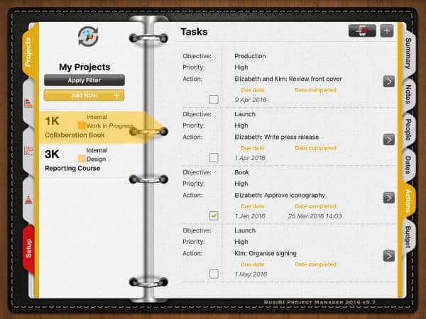
From within your project, the Actions tab holds your tasks. This, I think, is where the app is most limited. You cannot change the order of your tasks. The latest task to be added drops to the bottom of the list. Tasks appear like this:

You cannot hide completed tasks either, which means if you have a long task list you are going to be constantly scrolling to the bottom to see what’s still to do.
If you complete a task it does not automatically change the percent complete of the project. While this could be a good thing, you are reliant on making those changes yourself, and making them honestly. There’s a risk that your team’s projects will sit at 80% complete for quite some time…
The Bubble Chart
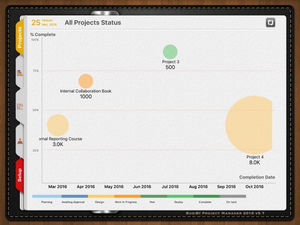
There’s probably a proper name for it, but I’m going to call it the bubble chart. This is what it looks like.

Remember that above I said that percent complete doesn’t automatically update? It does from the bubble chart. It’s actually pretty cool to drag the bubbles around and automatically change the end date and percent complete of projects. Makes me feel very much in control!
In terms of reporting at a big picture level, this is really easy and really visual. It’s probably worth the £3.99 for just using this screen as a reporting tool. You’d only need to put in a few details of all your projects and suddenly you’ve got a hugely useful, easy to understand portfolio view of your projects.
The Trouble With Value
Out of the box the project summary comes with the field ‘Value’. This is OK, but it’s not the way that I think of my projects. Maybe in a consulting environment you spend a lot of time thinking about how much each contract is worth. But not in my world, where most of my projects are for internal purposes.
The great thing about being able to change the terminology is that I could rename that field to ‘Priority’. Which I did. It’s limited to numeric entry though, so I couldn’t give a project a High/Medium/Low ranking. Instead, I numbered my projects in priority order 1 to 4.
On the bubble chart that shows all projects status they then show up with the priority marked instead of the financial value, although the bubbles are still sized by value. And on the Portfolio Analysis tab the terminology doesn’t update and my new ‘Priority’ label still reads ‘Value’. Whatever. It’s actually more useful to filter the portfolio view by percent complete or end date to give you a realistic view of what work is happening and what should be happening right now. Again, the more projects you have on the go at once, the more benefit you’ll get from this.
The Flipboard
Flipboard? That’s a fancy way of saying ‘ringbinder’. The information is displayed to make it look like a ringbinder, and you flip the pages. You can switch off the ringbinder graphics, though, to make it look more like a notepad.
The styling worked for me because I like notepads but it’s not as much of a clean presentation as other apps I have tried.
Standalone For Less Hassle…
If you are working on a client site then you can’t always tap into their wifi and get access to update your projects. I have apps that I don’t like using because I have to be connected to the internet to get them to do anything and most of the time I use my iPad on the train, or in meetings at someone else’s offices.
BusiBI works as a standalone app and you can sync it later, when you get somewhere with decent signal, so that is a plus.
…But Collaborate If You Need To
You can add other team members, if you pay the additional iTunes fees. It’s not expensive, which is helpful if you’re arriving on site as a consultant and find they client has nothing. You can’t easily demand that they implement Microsoft Project Server and Sharepoint or tools like that, so this is a low cost way to keep the team on the same page.
You can limit the projects that they have access to for security.
Support
There is no online help, training guides or even FAQ on the BusiBI site (at the time of writing). There’s no in-app help. You can email the support teams or send a bug query through a contact form on their website, but that’s basic.
It’s pretty easy to use, but I’m the kind of girl who likes a little bit of info above and beyond screenshots. This would have been helpful to work out what the little numbers next to the project phase means. It’s not number of tasks. It’s not number of resources. The colour relates the project phase, but the number? I can’t work it out.
In Summary…
If you’re managing ‘initiatives’ rather than full-scale projects then this is certainly a useful tool. The task list is really limiting and as that is the feature I’d spent most of my time using then it probably isn’t for me.
Where it excels is in the big picture stuff: the bubble chart is really good. The portfolio view with filters is also helpful, as long as the underlying data is sound (the dummy data I put in didn’t make the view look that great until I’d replaced it with something more realistic). I like how you can drill down from the portfolio view to the details of the project.
Probably the best feature is the speed. It’s really fast because you aren’t connecting to the internet for every request. When you’ve got a client on the phone or your sponsor standing at your desk then you’ll appreciate the speed.
Full disclosure: I have not been paid for this review. I bought the full product.
